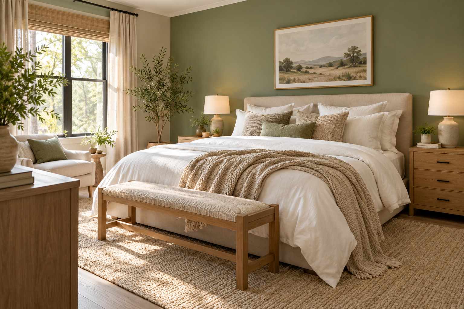
A bedroom color combination works through proportions, materials, and light, not just two paint chips placed together. Begin with the floor and furniture you plan to keep, then decide which color will cover the largest area. These bedroom color combos show different ways to distribute a palette across walls, bedding, and smaller details. Test samples in your own room and look at them at different times of day. You can often try a new combination through textiles before committing to paint.
Key Takeaways
- Choose colors alongside the floor and furniture that will remain.
- Give one color the main role and use others more selectively.
- Check samples in daylight and under your evening lighting.
1. Warm White and Sage
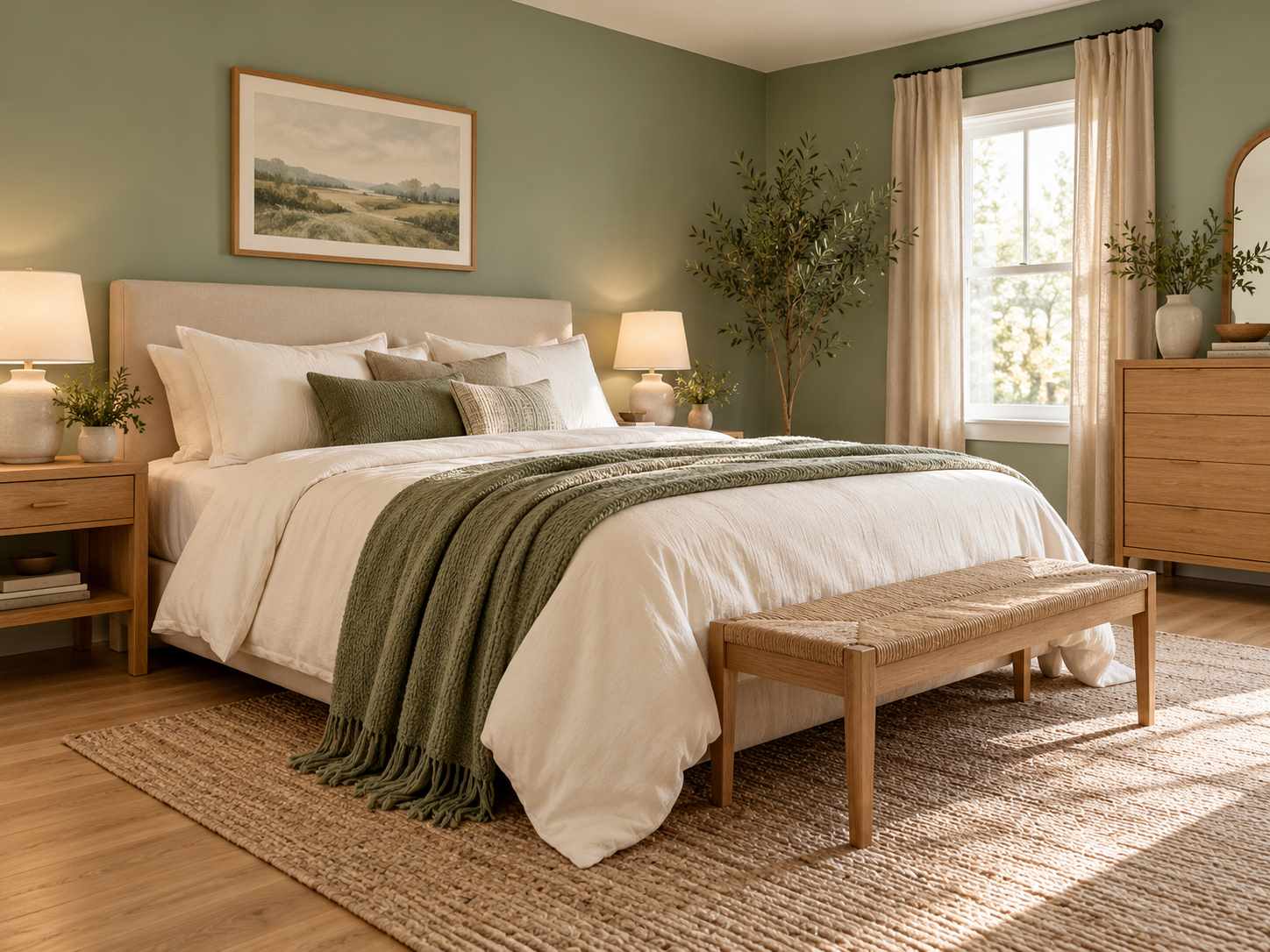
Use warm white on the main bedding and sage on the wall or a substantial throw. Light oak can connect the colors without a sharp contrast. Compare the sage with the floor, because some versions lean gray while others have a yellower undertone.
2. Cream and Terracotta
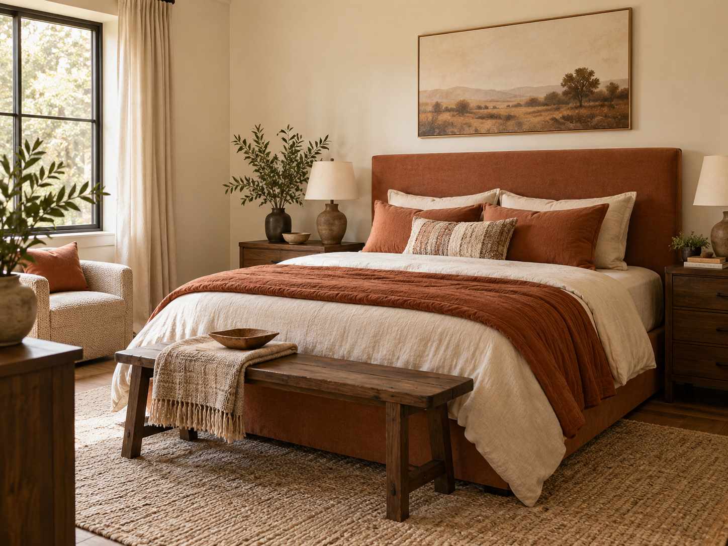
Cream gives terracotta room to feel warm rather than intense. Try a clay-colored cover or headboard against plain cream walls before painting a larger area. A little darker wood can anchor the combination, while too many orange accessories may make it feel repetitive.
3. Dusty Blue and Oatmeal
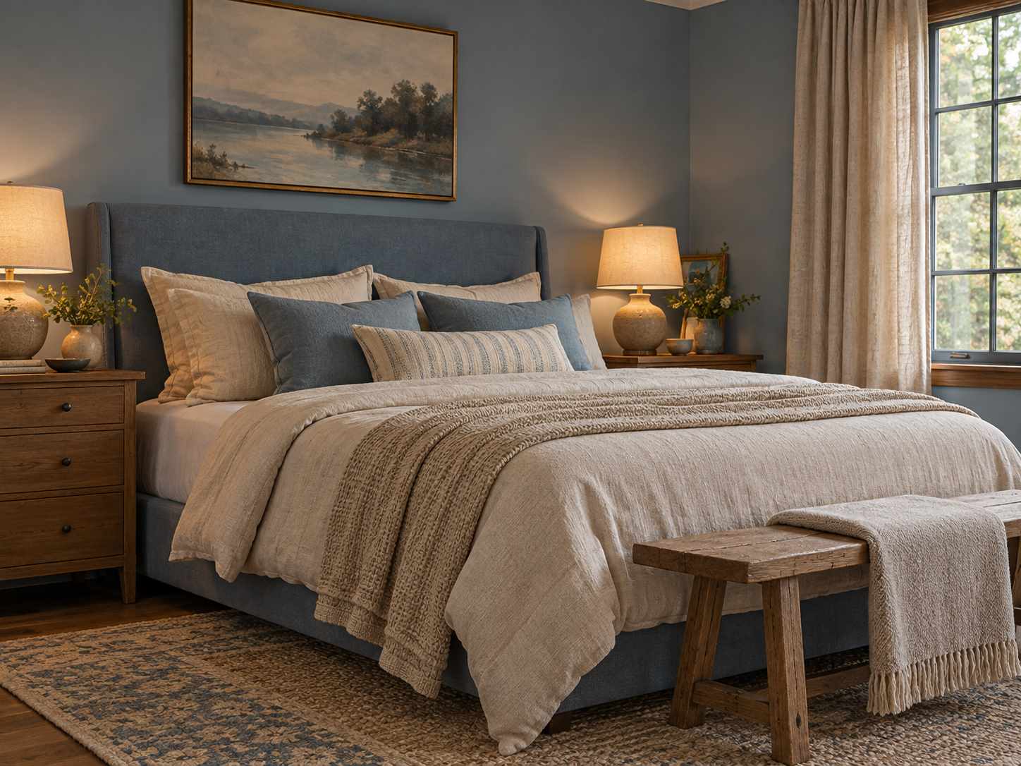
Dusty blue can provide a quiet colored surface with oatmeal textiles adding warmth. Choose fabric textures that keep the two muted shades distinct. Test the blue in evening light; if it feels too gray, a warmer lamp shade or natural wood may improve the balance.
4. Soft Pink and Olive
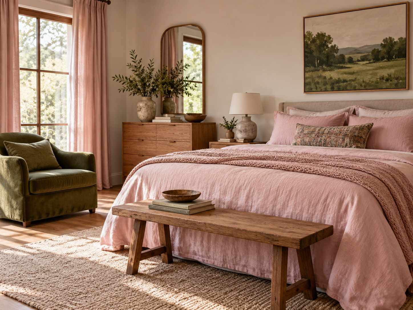
Let soft pink cover the larger textile area and use olive in a chair, cushion, or artwork. The different color depths can make the pairing feel more structured. Keep the remaining surfaces quiet and compare both shades with the room’s existing timber.
5. Charcoal and Warm White
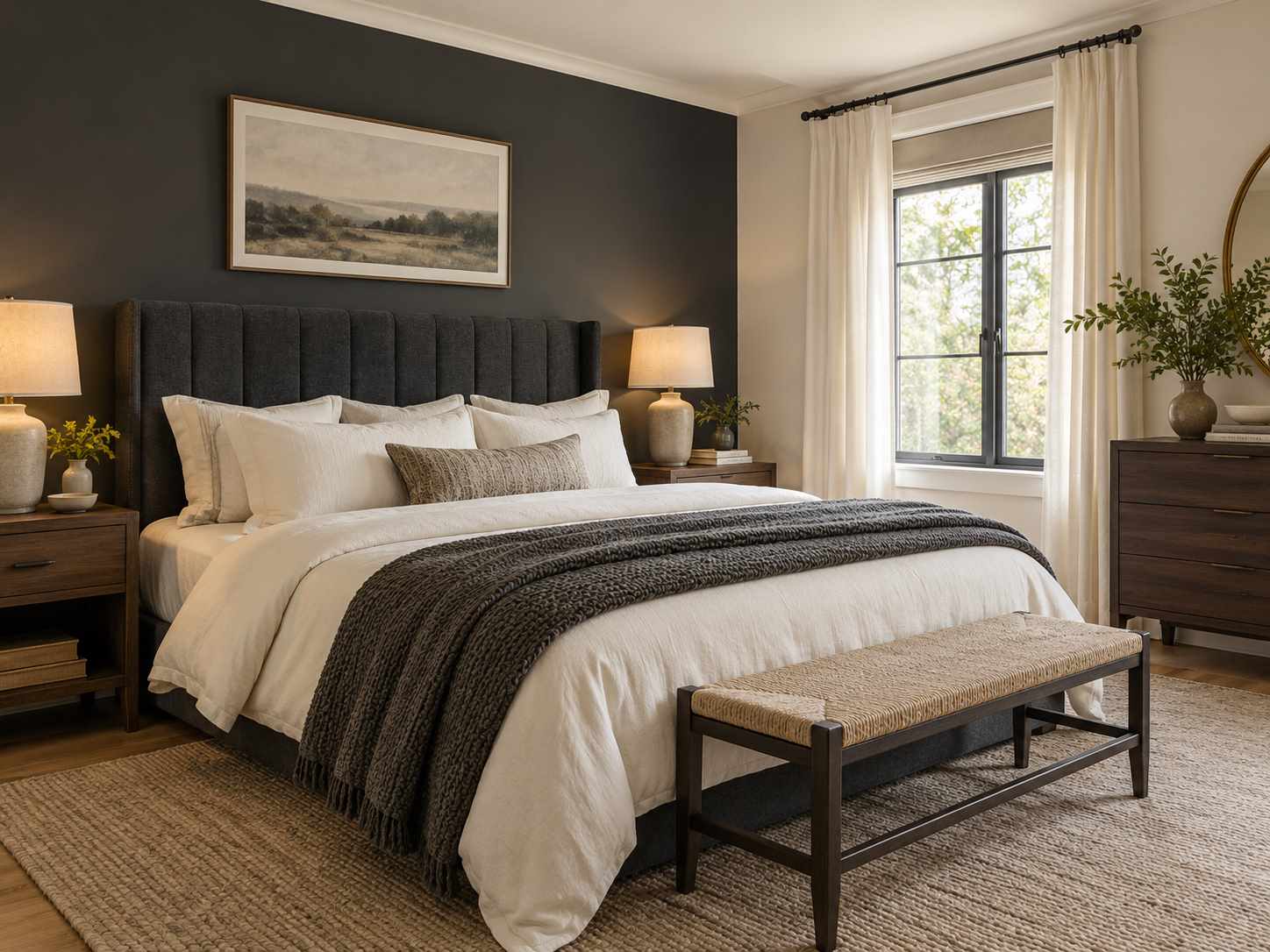
Charcoal can define a headboard or one wall while warm white keeps the bedding clear. Use texture to separate dark fabric from dark paint if both appear together. Check whether the room has enough useful lighting before expanding the darker surface.
6. Navy and Tan
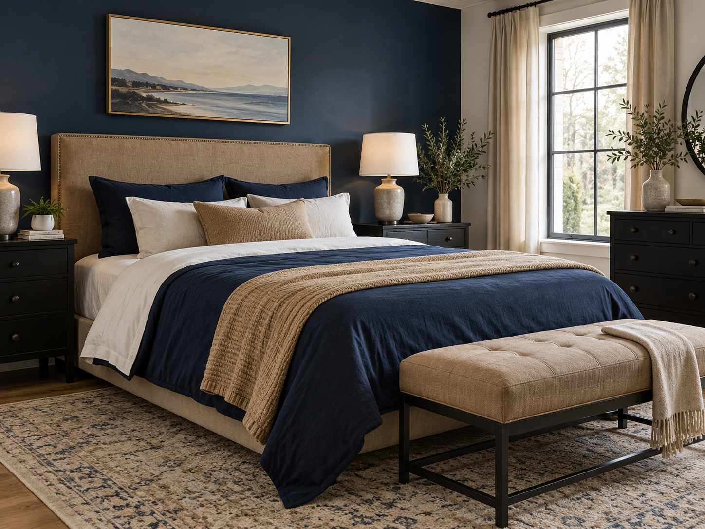
Navy bedding or a painted wall can sit well with a tan upholstered headboard. Let the material difference provide part of the contrast. Add a lighter sheet layer so the bed does not become one dark block, and check the navy against any black furniture.
For a practical foundation for the bedding, see our guide to layering a comfortable bed.
7. Butter Yellow and Soft Gray
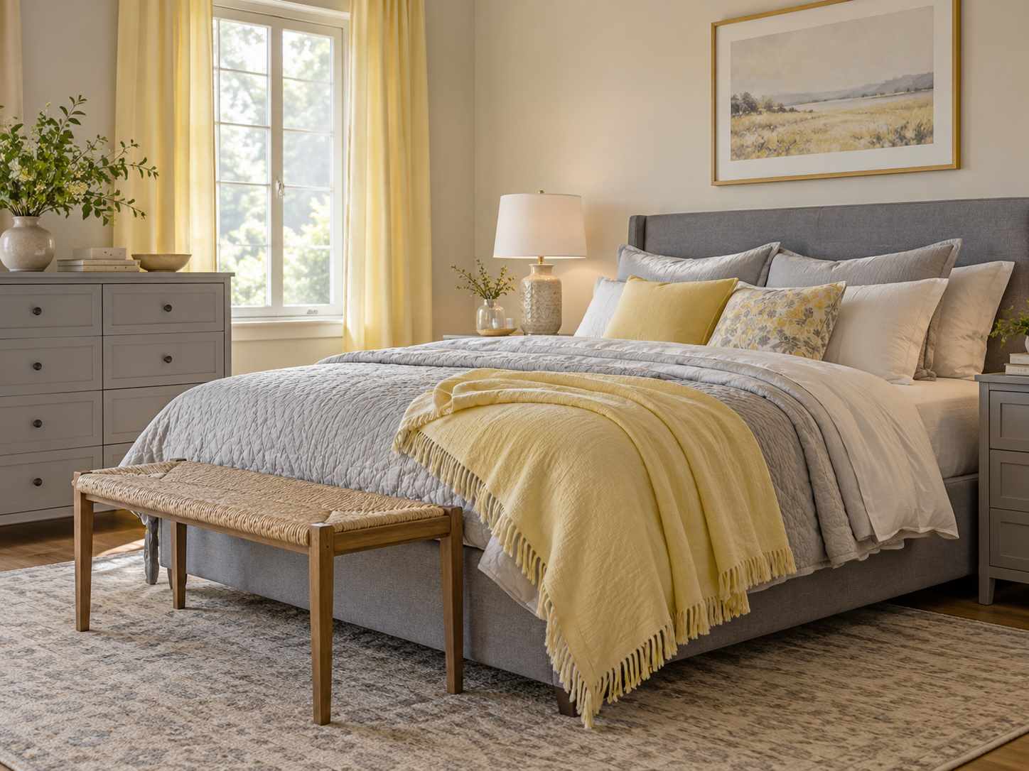
A gentle yellow can warm a gray bed frame or cabinet. Keep the yellow restrained and compare the gray’s undertone before buying new textiles. A gray with a strong blue cast may feel different from a warmer gray in the same room.
8. Forest Green and Cream
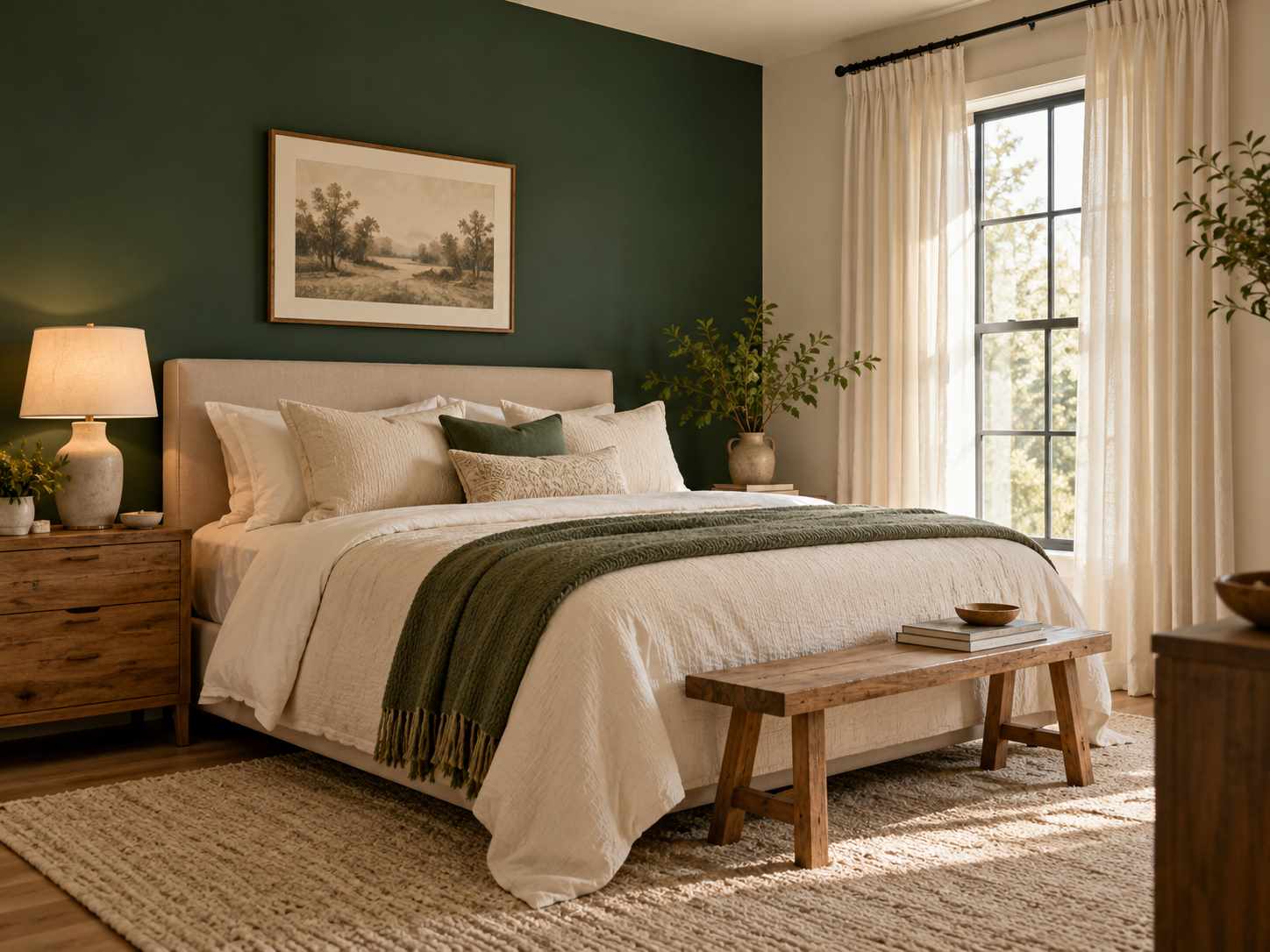
Forest green can create a clear backdrop for cream bedding and lighter curtains. Choose one main dark surface and let the rest of the room remain easier on the eye. Natural wood and a simple lamp can add warmth without introducing another strong color.
9. Lavender and Light Oak

Lavender textiles can give light oak furniture a softer setting. Try a muted shade with gray or brown depth rather than a very bright purple if you want a quieter room. Warm white sheets keep the pairing clear and help separate the fabric layers.
10. Burgundy and Blush
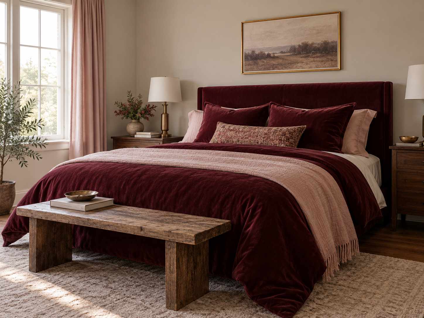
Use burgundy in one substantial textile and blush in a smaller or lighter layer. The difference in depth matters more than covering equal areas. Keep the wall simple and check the fabrics together, since burgundy can lean brown, purple, or red.
11. Chocolate Brown and Pale Blue
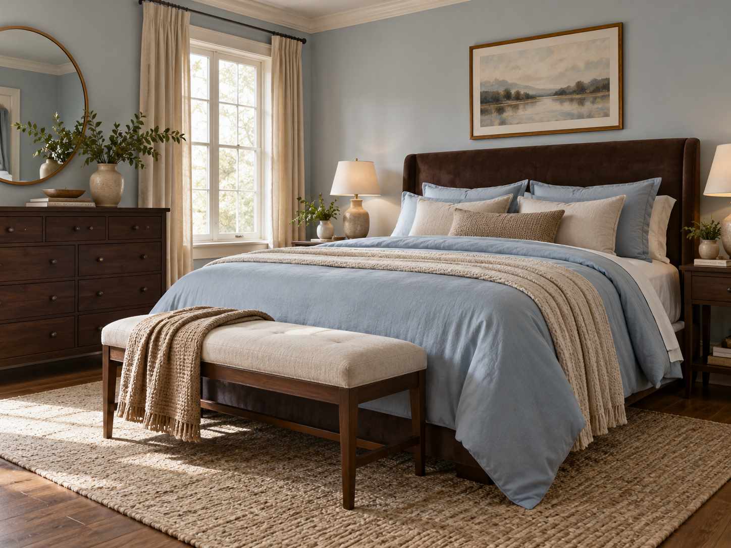
A brown headboard or dresser can feel less heavy beside pale blue bedding. Keep a warm neutral between the colors if the contrast feels abrupt. Smooth and woven fabrics can add variation without another pattern competing with the palette.
12. Peach and Warm White
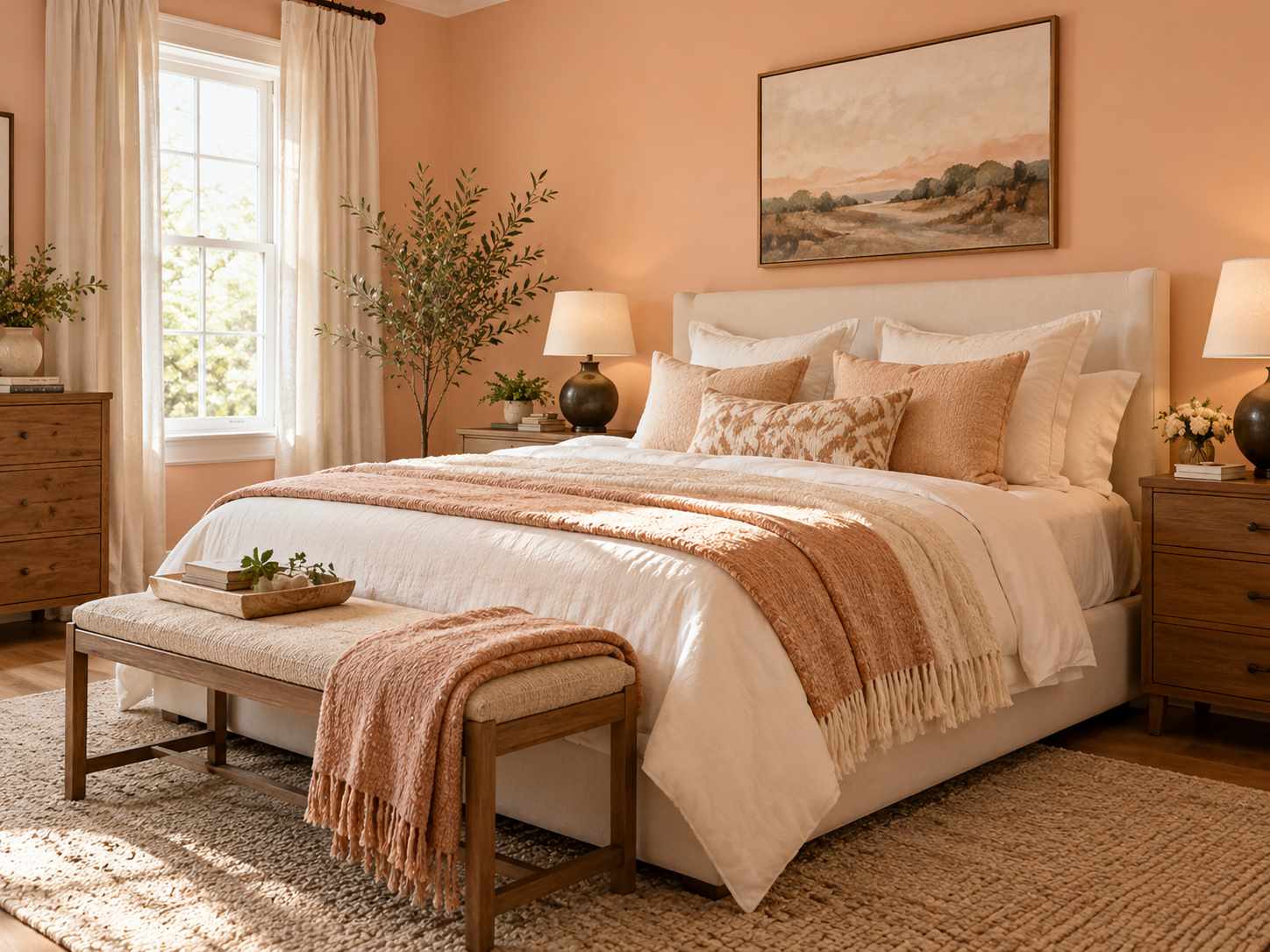
Peach can provide a soft wall color while warm white defines the bed. Compare the paint with your skin-toned textiles and wooden furniture so the room does not become overly uniform. A small darker lamp base or frame can add useful definition.
For ideas that support a compact layout, explore our small-space decorating guides.
13. Black and Beige

Black works well as an outline in a bed frame, lamp, or picture frame while beige covers larger soft surfaces. Use more than one beige texture to create depth. Keep the black accents selective so the room does not feel segmented by dark lines.
14. Teal and Sand

A muted teal cover or wall can sit against sandy curtains and upholstery. Choose whether the teal should lean green or blue by comparing it with the existing floor. Keep metallic accents small, since the color contrast already provides plenty of interest.
15. Rust and Denim Blue

Rust and denim blue can make a bedroom feel casual and layered. Give one color the main bedding role and use the other in a throw or cushion. A plain cream sheet layer helps the two colors remain distinct without needing another printed textile.
16. Warm Gray and Rose
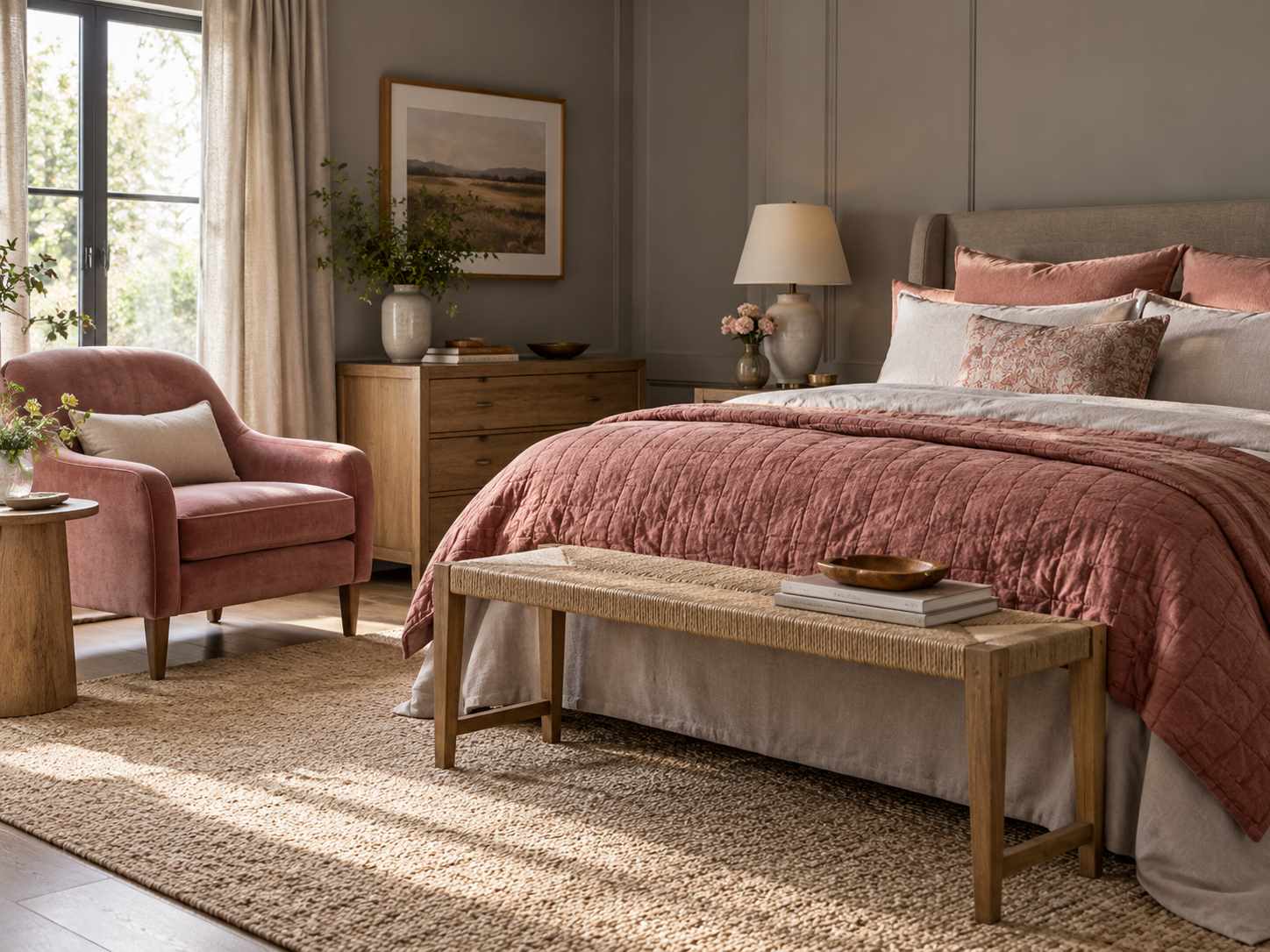
A warm gray background can support rose-colored bedding or a small upholstered chair. Compare the gray beside the actual rose fabric rather than selecting each separately. A little natural wood can keep the combination from becoming too cool or flat.
17. Ivory and Natural Wood

Ivory and wood can be a complete palette when the surfaces have enough variation. Mix smooth sheets, a textured cover, and a visible timber grain rather than adding a separate accent color automatically. Check that different ivory shades look intentional together under your room’s light.
Frequently Asked Questions
How many colors should a bedroom have?
There is no fixed rule. A main background, a substantial second color, and a small accent are a useful starting point, with texture providing additional interest.
Should I choose paint or bedding first?
Start with the items you will keep or the fabric you most want to use. Paint is often easier to compare once the larger textiles are decided.
Can dark colors work in a small bedroom?
They can, but check the actual light and how much contrast you want. A dark headboard or single textile lets you test the effect before painting the room.
Why does a paint color look different at home?
Light, neighboring surfaces, and the size of the painted area affect how you perceive it. Test a sufficiently large sample and check it throughout the day.
Do all the fabrics need to match exactly?
No. Related tones and different textures can create a more layered result. Compare the pieces together and look for a clear relationship rather than identical shades.
Related Decorating Guides
- 17 Bedroom Curtain Ideas for Light, Privacy, and Texture
- 17 Bedroom Refresh Ideas for a More Restful-Looking Room
- 17 Bedroom Decor Ideas on a Budget Using What You Have
Conclusion
Choose a palette around the room you have, then decide how much space each color should occupy. Test the combination with fabrics and paint samples before making a large change. Save two or three possibilities and compare them under the light you use every day.
Browse more palettes and furnishings in our bedroom collection.